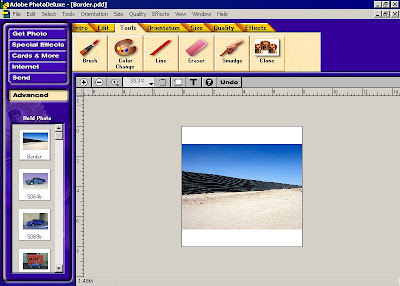
After I have chosen the picture I'm going to use, I'll open it up in my favorite photo editing software, which is Adobe Photo Deluxe 2.0. This program came out in 1997, so you can see you don't have to have the latest version of Photoshop to be able to achieve similar results as mine. The key to everything is that I'm going to edit my photo so that it can be printed out on a sheet of paper that is legal sized, i.e. 8.5 x 11 inches. After my chosen photo is loaded in the photo-editing software, I'll change the dimensions so that the width of the image is exactly 8.5 inches. Your printer might cut off a little on both edges, but that's all right. You'll still have enough of the image for it to work properly. At this point, it doesn't matter what height your picture is because we'll be taking care of that shortly. In the above image you can see what I did next. I decided that this particular image needed more sky area above the top of the fence. So, I simply made the working area larger, without making the image itself larger. I randomly made it 8 inches tall. You can see the original image now centered in the working area. The next image will show you how to make your sky "taller."
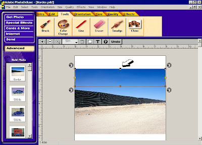
To create more sky with which to work with, and I felt the image I was going for would work better with more sky above the fence, I duplicated part of the sky toward the top. Make sure you don't include any of the fence or other solid objects because you are going to stretch this duplicated area up to the top of the working area. In the above image, you can see the duplicated area of the sky I created and an arrow is pointing at the handle I'm going to grab and drag to the top of the blank working area. By having created this duplicate area of the sky right over identical sky below in the original picture, I now have a piece of sky that is not connected to anything else and has it's own properties. I will drag the handle so that it comes to the exact edge of my working area at the top. When finished, it will resemble the picture below.
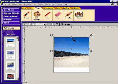
Here is the extra sky area I duplicated and pulled up so that it covered all the blank area I had created above the original image. By duplicating an exact copy of the sky right over where the sky was in the original image below it, when I drag the upper edge, it doesn't move the lower edge from where it is found in the orignal image underneath the duplicate. In reality, all I'm doing is just stretching part of the sky so that it takes up more space above the fence. When done properly, and since it's on top of the original image below, what's below the duplicate piece won't show. And the fact that the new piece is just sky won't cause anything to look stretched - it's just non-descript blue anyway.
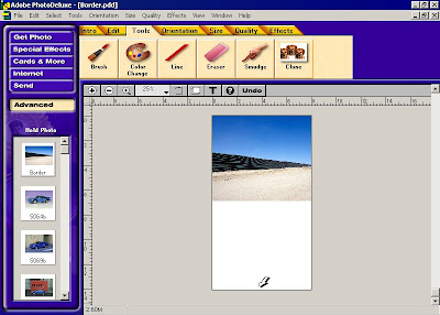
Now that I've got my top edge where I want it to be, I'll work on the bottom edge. It's time to create a new working area, so I'll extend it so that when I'm finished with it, it will be exactly 14 inches tall. Now, in my program, I have to first make it much longer than I'll need - anything that will trim down to 14 inches, because it always adds an even amount of new blank area above and below my image. In this case, I added 26 inches, trimmed all the white blank area above my sky, and then trimmed the bottom edge until it was exactly 14 inches tall. You can see an arrow pointing to the new bottom of my working area and by looking at the ruler on the left, you can see it is exactly 14 inches. Now for the part that makes my method most effective. I feel I have created this method, because I have not seen it done like this anywhere else. As far as I know, this might be the first time my method was ever employed. If so, now you'll be able to use it as well and get great results like I have been getting.
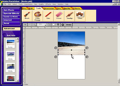
Like I did when I created some additional sky area at the top of the image to stretch up, I'll duplicate some of the dirt road over itself to pull down. You can see what little amount I had to work with when I did so. If you look close at the original image, you'll see a largish rock on the extreme left, just below the bottom edge of the fence, but immediately above the area I chose to duplicate. By making sure I didn't duplicate any of the area which had any objects that could potentially end up being stretched, this ensured that I would have plenty of plain dirt road area to work with and bring down to the bottom of my working area. An arrow points to the handle I dragged to get the duplicate dirt road area to stretch down to the bottom of the blank white area. Below was what my results looked like when finished dragging the duplicate dirt road piece. Since it was created right over the image below, like the sky was above, I could drag the bottom edge of the duplicate piece without changing the top edge's location in the original image. This is critical so that everything matches up when finished.
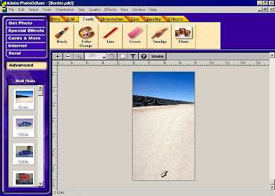
This is what my picture looked like when I had dragged the duplicated dirt road piece's bottom edge to the bottom edge of my blank white working area. The arrow points to show that it has been placed at the exact bottom which makes the image now equal 14 inches exactly in height. Once I got it to this state, I saved it as a jpeg and then printed it out on legal sized 8.5 x 11 inch printer paper. You can save it as a bitmap or tiff or whatever you prefer, that part doesn't really matter. All you need is something that can be printed. Once it is printed out, it should like this below:
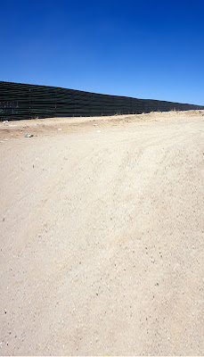
This is what my finalised background image looked like after it has been printed - it is the actual version of the edit work I did and used myself. You might be able to discern that the dirt road area which was duplicated and stretched downwardly looks warped out of it's correct dimensions. And, you would be right. Here's how I get around that so that the resulting image I ended up with "looks" normal from top to bottom for photographing:
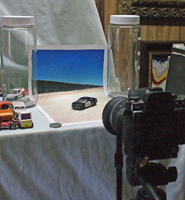
Here you can see the image I created and printed out and placed into position on my homemade photo stand that is a permanent fixture upstairs in my house. The secret to getting the lower dirt road area to resemble it's correct original dimensions is that I'll bend the image and hold it in place with what I chose as my horizon line positioned at the bend area. By placing my camera almost "head on" to the front edge of my image and photographing it at such a low angle, (as low as I can get), this will make the stretched-out dirt road appear, to the human eye, like it originally looked. It's a trick of angles, but your eye will just see it looking normal again. That's how I get my diecast vehicles to actually "be" in my pictures and blend so well. You can place your car closer to the camera or farther back from the camera, depending on how in or out of focus you want your background to be. Now, a little more information on my photo stand and how I set up my images for lighting them and then photographing them:
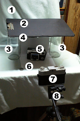
My photo stand is sitting directly below two 4-foot-long fluorescent bulbs. They make a good, even light source, but any kind of light will ultimately work just as well. You just have to set your camera for the lighting type you use. Now, to describe what the numbered parts of my setup are:
1. My permanent photo stand, but if you have a two-foot square area on your table, this will work just as well. It doesn't have to be permanent.
2. A dark object, in this case a clipboard, to block the light from above. Heavy cardboard will work, too.
3. Empty instant tea jars to hold the object I use to block the light from above. These have the advantage to being extra tall and clear so that they don't block light from the sides.
4. A prop to hold the back of my image up straight. It can be anything. In this case, it was a small zoom lens!
5. My subject, which can be a diecast vehicle, a camera or an action figure - whatever I'm shooting and will fit in the width of my printed image.
6. The image I created above.
7. My camera. You can use a film camera or a digital camera. Once you've used your photo stand enough, you'll figure out what the best settings will be for each type of subject.
8. A sturdy tripod so that your camera can remain totally rigid for the long exposures my photo stand requires.
Once everything is in place like you see pictured, I'll set my camera to go off with the self timer and hold two sheets of legal-sized printer paper in my hands and reflect the light from above all over my diecast vehicle or whatever my subject is. By waving the papers left and right and up and down, I can get a good, overall even lighting on my subjects. Most exposures take in the 20 to 30 second range, so you'll have plenty of time to illuminate your subject all over and evenly. It really works well, as you can see in the very topmost image of this post. Here is the image I took using the background I created above:
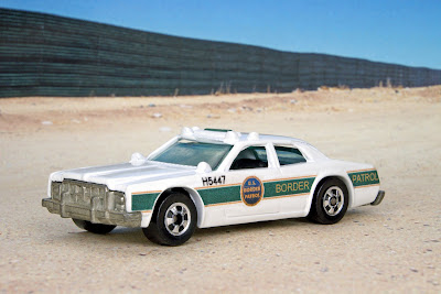
This is my custom-painted Arizona Border Patrol car looking right at home at a border fence between Arizona and Mexico. And it looks like it's actually there, because, in a way, it is in the picture. I ended up only having to take one single picture because I know what my settings are generally going to be. It turned out like this and then I cropped it down to whatever size I wanted it to be, which in this case was so I could have a regular 4x6 inch picture made of it at the CVS Pharmacy photo booth. Once you get this technique mastered, you will be able to take images like these below, which all employ this same method of creating your prepared/stretched image, setting up your photo stand and taking the picture:
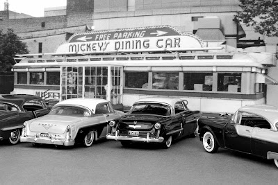
I call this one Mickey's Diner, 1955, because I converted it to black and white to make it look old.
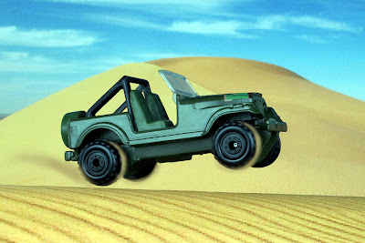
Here's one of a jeep making it's way through the desert. The lower desert is actually a separate photo placed in front of the background image. I simply rolled it over a t-shirt to make it look round like a sand dune.
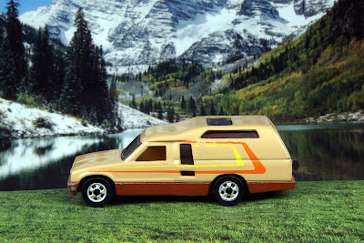
Like the above shot, I employed two different images for this shot as well. The grass was printed out and rolled around a t-shirt to make it look sloped toward the lake picture in the background. So, if you follow this method, there's no reason why you can't achieve similar results with your diecast vehicles. And it's fun, too!

 Hot Wheels released their version of the British-made Lotus Esprit in 1979 and called it "Royal Flash." The first version was in white, and apparently it was only released one more time, in orange. I started with an old first version model and decided it needed to be "brought back to life" by restoring it. Rather than recreating the original paint scheme, I decided to go with a finish in blue that would look deep. This would be achieved by using a certain kind of candy apple-type paint over a base coat of chrome silver. The car itself was in decent shape, as you can see by the above photo, but the wheels were pretty worn. I opted to update the wheels as well.
  Here's a view of the base, showing some age, but not pitted anywhere. The way it was designed employed only one rivet instead of the usual two. This would be drilled out and the body pieces would be cleaned and the paint stripped.
  Here's another view showing how the original paint was heavily chipped at most edges and the tampo in red, white and blue was all but gone from the roof. Despite this, I thought it had a lot of potential.
  Here it is after the paint had been stripped and I was trying out some Hot Wheels real rider tires to see what they would look like. They ended up being a little too thick for the look I was going for, so I decided against using them.
  This image shows all the different pieces laid out, newly cleaned and the body sporting it's base coat of chrome silver. The plastic window glass piece wasn't cracked anywhere and shined up nicely.
  Here it is again with a test fit of the newly-painted body and with some different wheels and tires. It was starting to look like it would turn out nice and with a good "stance."
  And here is the finished car, with it's new deep blue paint and the modern wheels fitted. It certainly brings the car into the modern era and gives it a distinctive look all it's own. I had a lot of fun working on this project and I can't wait for the next one!


 Suntoys Toyota Tacoma


